Python for Data Analysis
Python is an invaluable tool for data analysis, being a high level language with a huge number of libraries. It allows you to quickly pull from any data source, run mathematical operations and create useful graphs as output. I started using Python for all my data analysis needs a few years ago and have not touched Microsoft Excel since.
These days, the first thing I do when looking at any new dataset, be it user research results, outputs from lab equipment used as part of a test of a system under development or data from machines in the field, is to perform some standard statistical analysis tools to describe the dataset. This description really helps to understand a dataset and begin to think how you might process the data to support a valid conclusion, it also sets you up for more complex analysis, for instance confirming the distribution before selecting a test for statistical significance. As this is something I do often, but normally only once per dataset, I use a template file rather than a custom module.
Descriptive statistics describe the basic features of a dataset. The very first step should always be to establish the distribution of the dataset as some statistical metrics and tests are only valid for one distribution or another. This is done using a histogram.
For the purposes of this example, we will need some example data.
import matplotlib.pyplot as plt

#plot histogram
plt.figure();
bins = 20; #choose between 5 and 20 bins depending on dataset size
plt.hist(y, bins);
plt.title("Histogram");
plt.xlabel("Data Reading Number (Counts)");
plt.ylabel("Frequency (Counts)");
plt.grid(True);

plt.show();
A histogram can be plotted using the module matplotlib. Histograms tell you how frequently different ranges of values occur. Histograms are sometimes confused with bar charts, a histogram is used for continuous data, where the bins represent ranges of data, while a bar chart is a plot of categorical variables.
import matplotlib.pyplot as plt

#plot histogram
plt.figure();
bins = 20; #choose between 5 and 20 bins depending on dataset size
plt.hist(y, bins);
plt.title("Histogram");
plt.xlabel("Data Reading Number (Counts)");
plt.ylabel("Frequency (Counts)");
plt.grid(True);

plt.show();
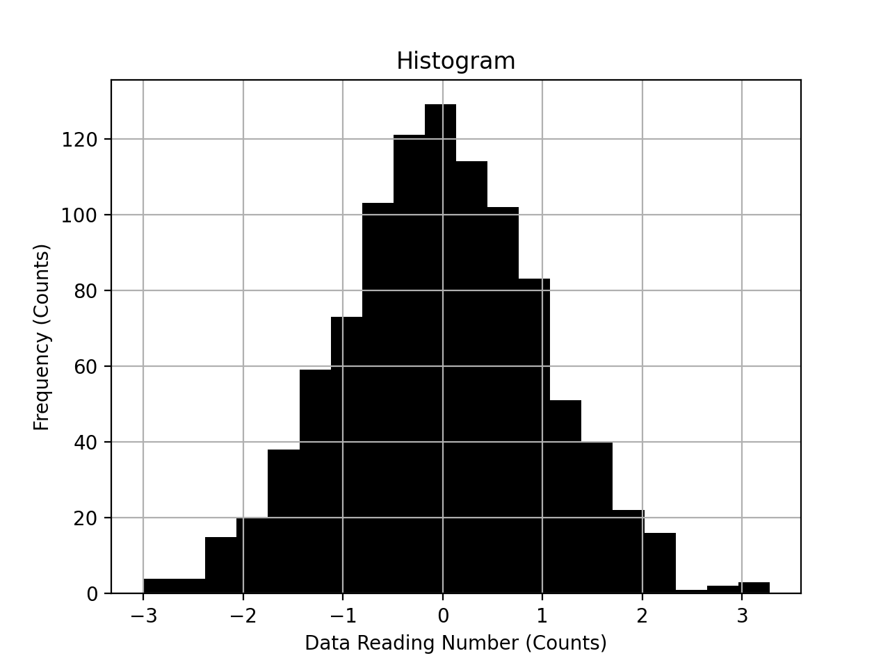
The data above is clearly normally distributed. The next step would be to identify and remove (or understand) outliers. Outliers are data points that are the result of experimental error, for instance a sensor was not calibrated for a given experimental run. There is no mathematical definition of outliers so looking for anomalies, or data points that deviate significantly from what is expected is a good place to start. A simple scatter or time series plot is very useful for this.
#0-1 normalise data
norm_y = [(i - np.min(y)) / (np.max(y) - np.min(y)) for i in y];

#plot scatter graph
plt.figure();
plt.scatter(x, norm_y);
plt.title("Values over Time to Identify Outliers");
plt.xlabel("Data Reading (Time)");
plt.ylabel("0-1 Normalised Value");
plt.grid(True);

plt.show();

This dataset does not seem to have any points too far out on their own so the key descriptive metrics can be computed.
Averages are a measure of a central tendency or typical value. Mean is the most common, calculated by summing the dataset and dividing by the number of values. It is heavily skewed by outliers and should be used on normally distributed data only. Median is the middle value and less skewed by outliers. Mode is the most frequent value(s) and is the only average suitable for discrete data and heavily skewed bimodal data.
Margin of Error – the maximum expected difference between the true population parameter and a sample estimate of that parameter for a given confidence.
Confidence in an Interval Estimate – confidence intervals specify a range within which the population truth is estimated to lie with a given probability. Calculations will vary depending on the distribution of the data.
Range is the difference between smallest and largest values.
Inter quartile range is the range of the middle 50% data points, gives a good indication of the amount of variation within the envelope of normal working practices.
Standard deviation is the average distance that each data point is from the mean (variance is standard deviation squared and useful mathematically). It is only valid for normal data.
Z-score is the number of standard deviations each data point is from the mean, Z-scores are unit-less and so allow results of experiments with different parameters to be compared.
Standard error is the estimated variation of the sample mean around the population mean
from scipy import stats

#compute averages
len = len(y);
mean = np.mean(y);
median = np.median(y);
mode = stats.mode(y)[0][0];
mode_count = stats.mode(y)[1][0];
range = np.max(y) - np.min(y);
iqrange = stats.iqr(y);
std_dev = np.std(y);
z_score = stats.zscore(y);
std_err = stats.sem(y);
con_inter = stats.bayes_mvs(y, alpha=0.95);

#print descriptive statistics
print("----------------------------------------");
print("|        DESCRIPTIVE  STATISTICS       |");
print("|        -----------------------       |");
print("|    qty of data: {:+d}                |".format(len));
print("|           mean: {:+4.3f}               |".format(mean));
print("| moe @ 95% conf: +\\-{:4.3f}             |".format((con_inter[0][1][1] - con_inter[0][1][0]) / 2));
print("| 95% conf inter: {:+4.3f}<p<{:+4.3f}      |".format(con_inter[0][1][0], con_inter[0][1][1]));
print("|         median: {:+4.3f}               |".format(median));
print("|           mode: {:+4.3f} (count: {:d})    |".format(mode, mode_count));
print("|          range: {:+4.3f}               |".format(range));
print("|       IQ range: {:+4.3f}               |".format(iqrange));
print("|        std dev: {:+4.3f}               |".format(std_dev));
print("|        std err: {:+4.3f}               |".format(std_dev));
print("----------------------------------------");

#plot z scores scatter graph
plt.figure();
plt.scatter(x, z_score);
plt.title("Z-Scores of Data Points");
plt.xlabel("Data Reading (Time)");
plt.ylabel("Z-Score");
plt.grid(True);

plt.show();

#plot boxplot
plt.figure();
plt.boxplot(y);
plt.title("BoxPlot");
plt.xlabel("Data Set");
plt.ylabel("Value (Original Units)");
plt.grid(True);

plt.show();

Hopefully this template comes in useful for your projects. You download the full code on my github repository here.